Health Insurance and High Prices: A Proposed Solution
Many health policy experts extol the virtues of transparency as an effective way to generate competition in the health insurance and health care markets. They expect that consumers who better understand what they are paying for will make informed – what economists call rational - decisions.
Sometimes consumers will get mad, too. Really mad.
Enter Connect for Health Colorado, the state’s health insurance marketplace, the website where people can compare premiums from different insurance plans.
After analyzing health insurance premiums from Connect for Health Colorado and other marketplaces across the country, Colorado had another “best” to add to its list. Not only does Colorado have the finest skiing, the lowest obesity rate, and the top quarterback, we also have the region with the highest individual market premiums in the country.
In Pitkin, Eagle, Summit and Garfield counties, a “geographic rating region” for insurance purposes, the lowest-cost bronze plan for a non-smoking 35-year old is $387 a month. But if that person moved to Denver, her premium would drop to $185 a month. Officials in some of these high-price communities threatened to sue the state for recommending the current geographic rating classification to the federal government.
Since the advent of the Affordable Care Act (ACA), carriers are prohibited from setting rates on factors other than these: Age, family size, tobacco use and geography.
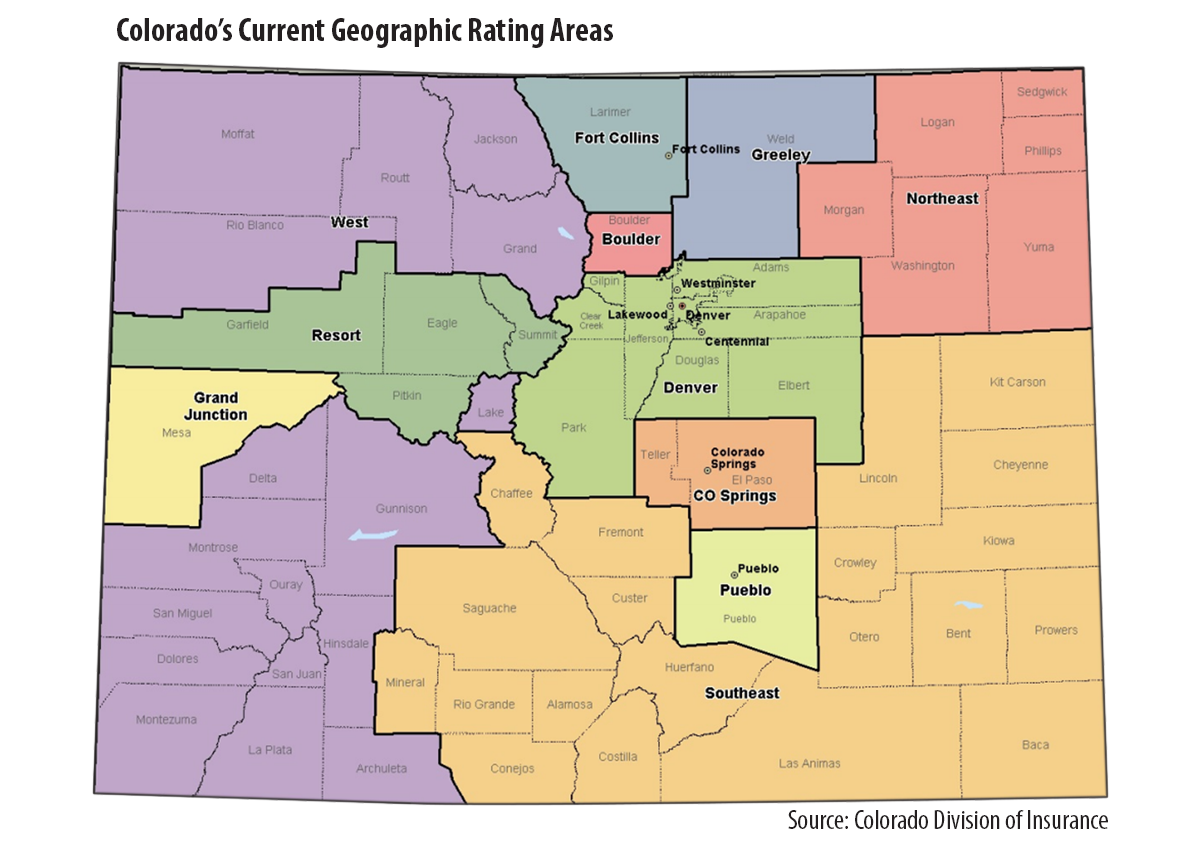
Then, the questions become: Do the state’s 11 geographic rating areas make sense? Why are premiums so high in some places in Colorado compared to others?
Colorado’s Insurance Commissioner, Marguerite Salazar, wanted to find out. And fast. The Colorado Division of Insurance (DOI) hired the actuarial firm of Miller & Newberg to comb through eight million commercial claims from the All Payer Claims Database and advise the DOI on these issues.
On May 2, the DOI released a report, “Colorado Total Health Cost and Geographic Study.” Using a set of actuarial standards, the actuaries evaluated the current and alternative geographic rating classifications. The actuaries concluded that DOI’s current classification of 11 regions held up the best, based on health care use, market size, total cost of services and cost per service. (See the accompanying map).
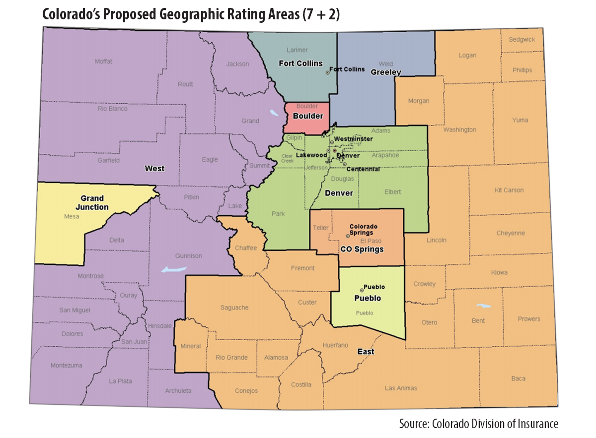
The actuaries also evaluated other options, such as collapsing the 11 regions into nine. This option, known as “7 + 2,” combines the expensive resort region with the other rural counties in western Colorado. It also combines the northeastern region with other rural counties in the eastern part of the state. (See map.)
This 7+2 option is the one DOI has proposed. Commissioner Salazar indicated that the decision represented the fairest way to distribute costs more broadly. The public is invited to comment on the proposal. Comments are due to the DOI are due on May 7. They may be sent to DORA_georatings@state.co.us.
What to watch: Will we hear from residents of areas where this plan may raise insurance rates?
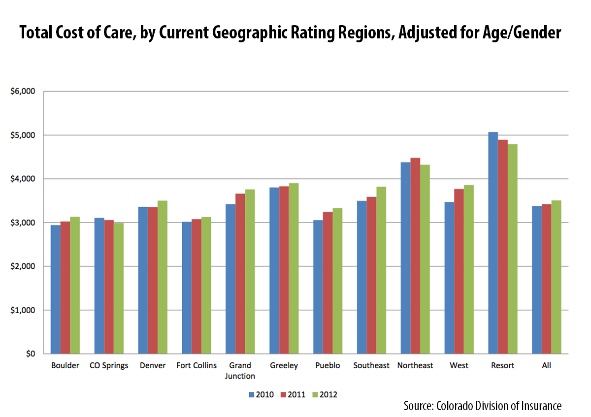
Meanwhile, the data nerds here at CHI found a cornucopia of interesting analysis in the actuaries’ report. For example, although Grand Junction has been highlighted nationally as a low-cost area for Medicare beneficiaries, based on the actuaries’ analysis of the claims in the APCD, it was beat out by three other regions in the commercially insured population. The data show that large population centers are associated with lower cost of care.
In addition, the data help us to look at what’s driving costs in the resort communities. Are the costs of individual services more expensive or do Coloradans in those communities tend to use a lot of services? A high level summary indicates that Coloradans in the resort communities had relatively modest utilization for outpatient and inpatient visits compared to their rural counterparts. However, they had the highest expenditures per service in the state for emergency room, outpatient visits and professional visits. In other words, the price per service appears to be driving the higher costs as opposed to the quantity of services consumed.
Of course, this analysis doesn’t control for other factors such as the health of the local population. But it provides an interesting window for analysis we haven’t seen before.